Brand Identity
Logo
#
Illustrator
#
Midjourney
#
ChatGPT
Browneria Barreto
Sweet brands in Brazil reach for baby blue and pale pink by reflex. Browneria Barreto looked like the rest, and Ísis (the founder) knew it. Sales kept climbing anyway, in packaging that said nothing about the care she puts into a brownie.
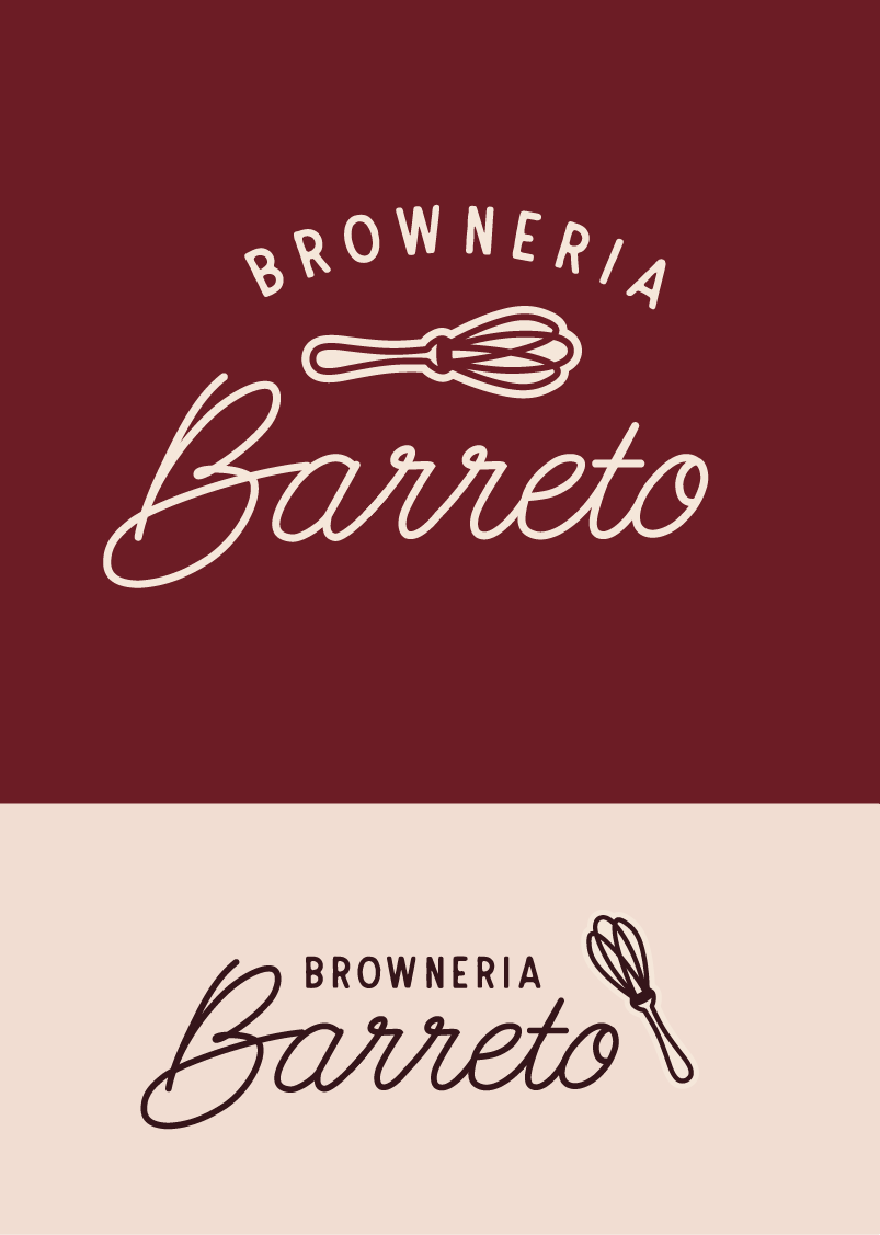
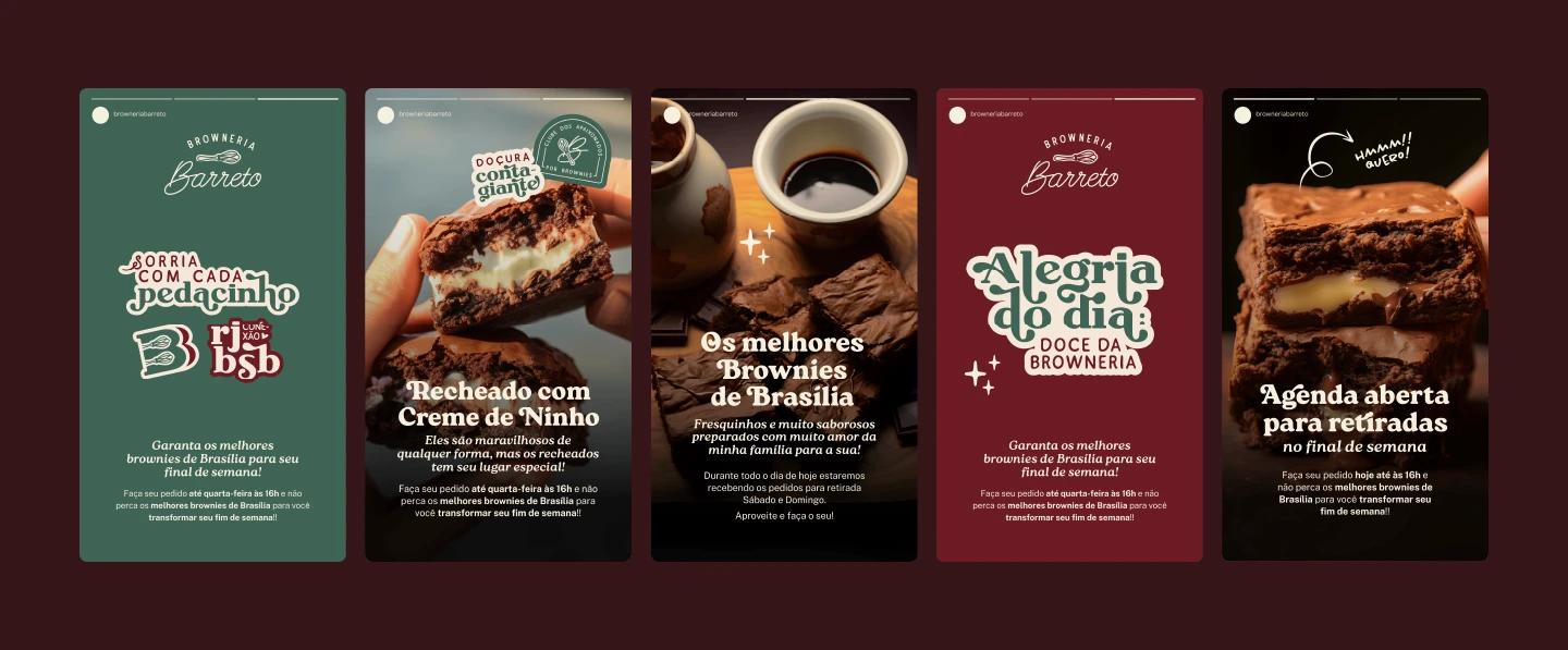
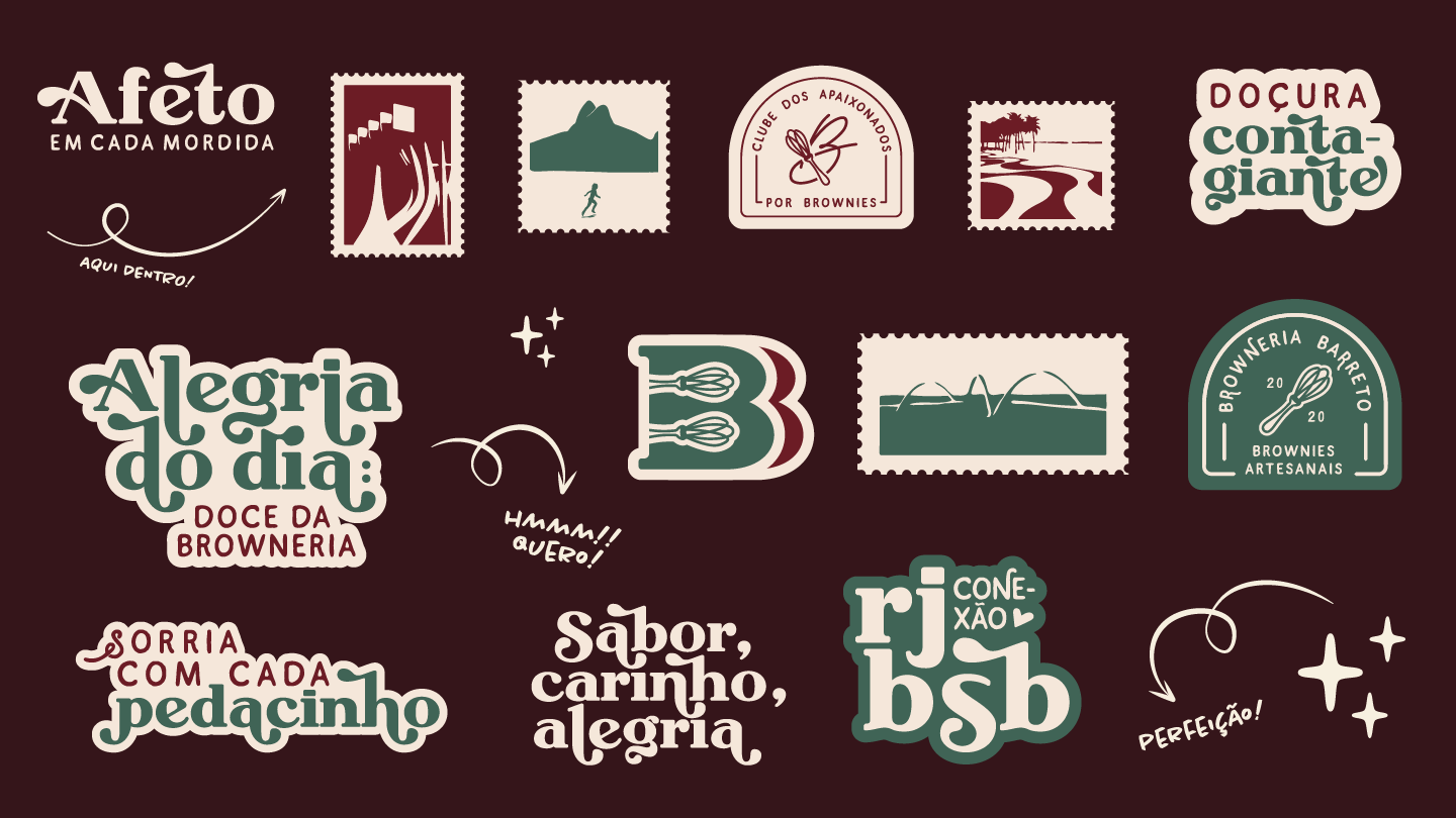
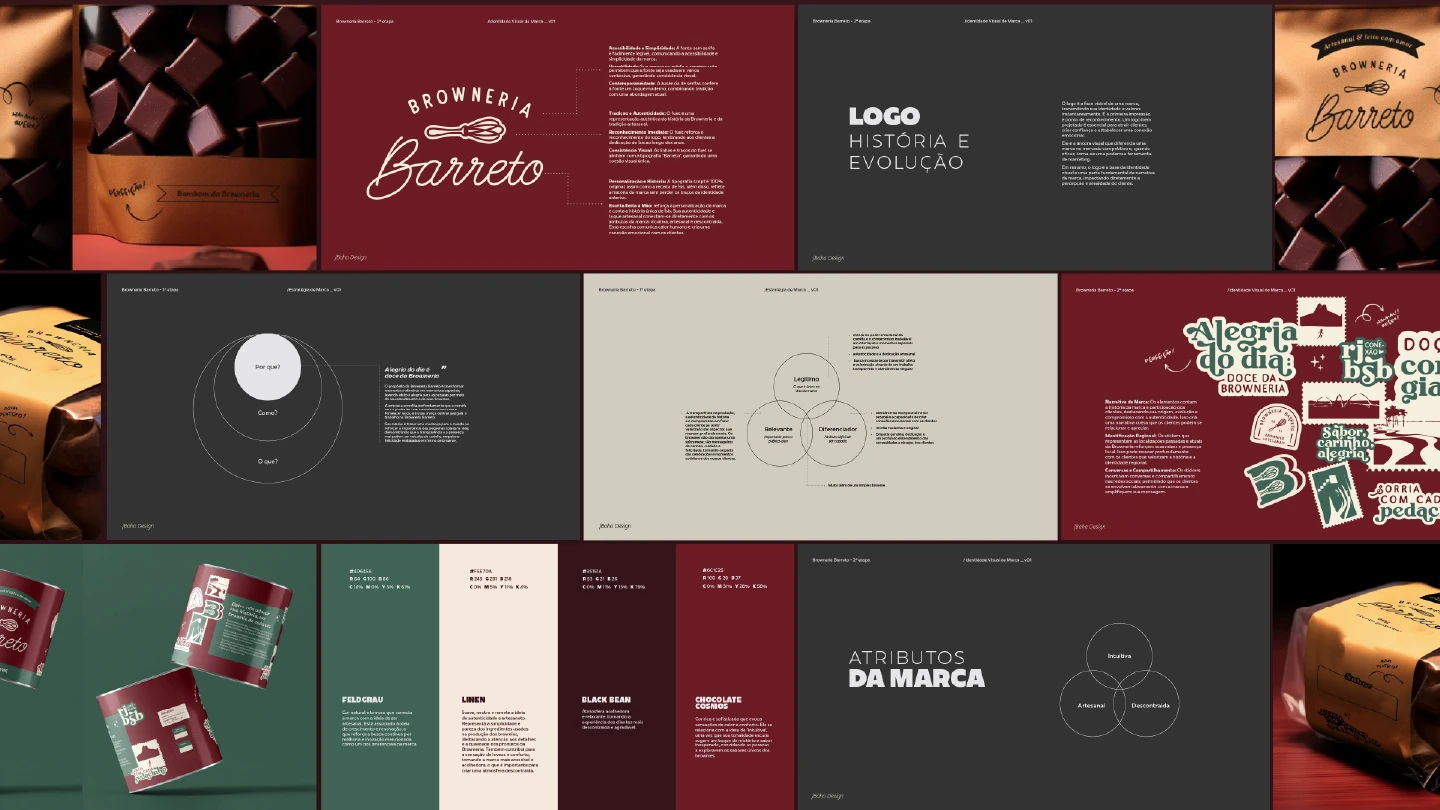
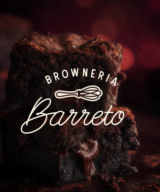
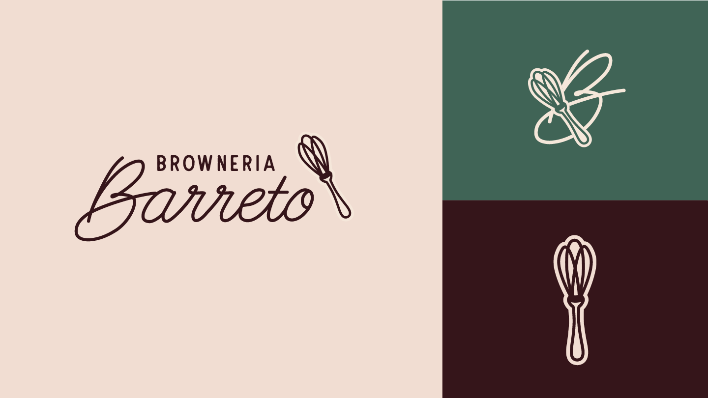
So we went warm instead of sugary: forest green, cream, two browned reds. Ísis had one request, the fouet, because it's the tool she picks up every morning. It sits right between the arched BROWNERIA and the script Barreto. The postage stamps follow her move from Rio to Brasília, and a badge calls the regulars the Clube dos Apaixonados por Brownies.
Process
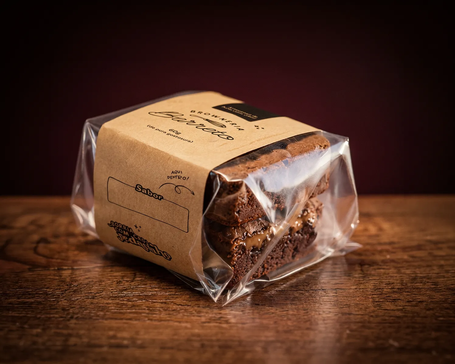
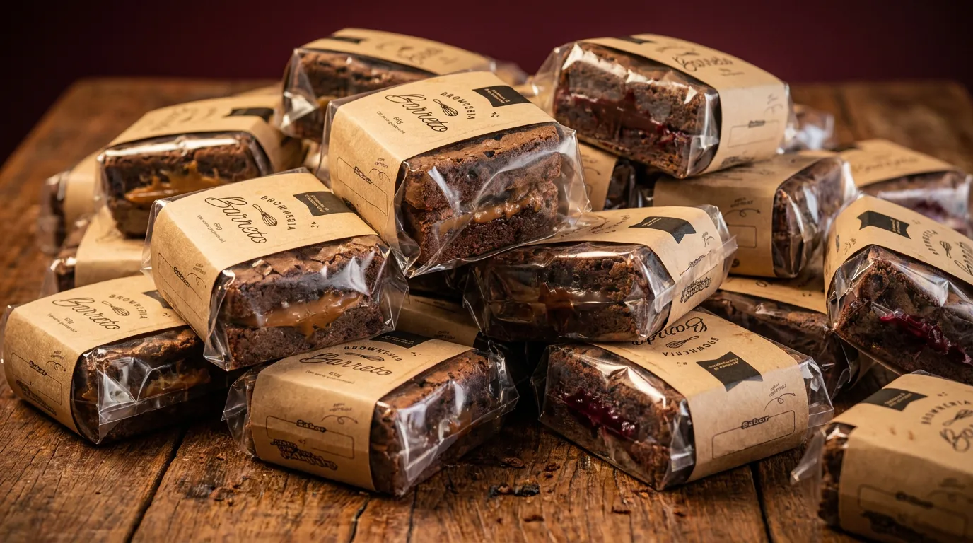
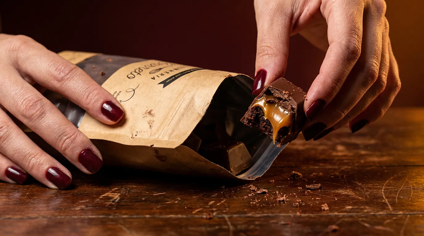
We couldn't print on the pouches, so we drew for a rubber stamp: single-color line art, no fills, nothing that needs registration. Ísis writes the flavor into a blank marked frame, with a little arrow pointing at the bag. The stickers handle the color a stamp can't.
Outcomes
An emotional presentation carried a lot of story, no need to say anything further than: approved in one round. First thing she said: the letters look like her own handwriting. Now her customers see her in it too, which they didn't before.