Brand Identity
Logo
#
Nano Banana
#
Photoshop
#
Illustrator
Salt & soul
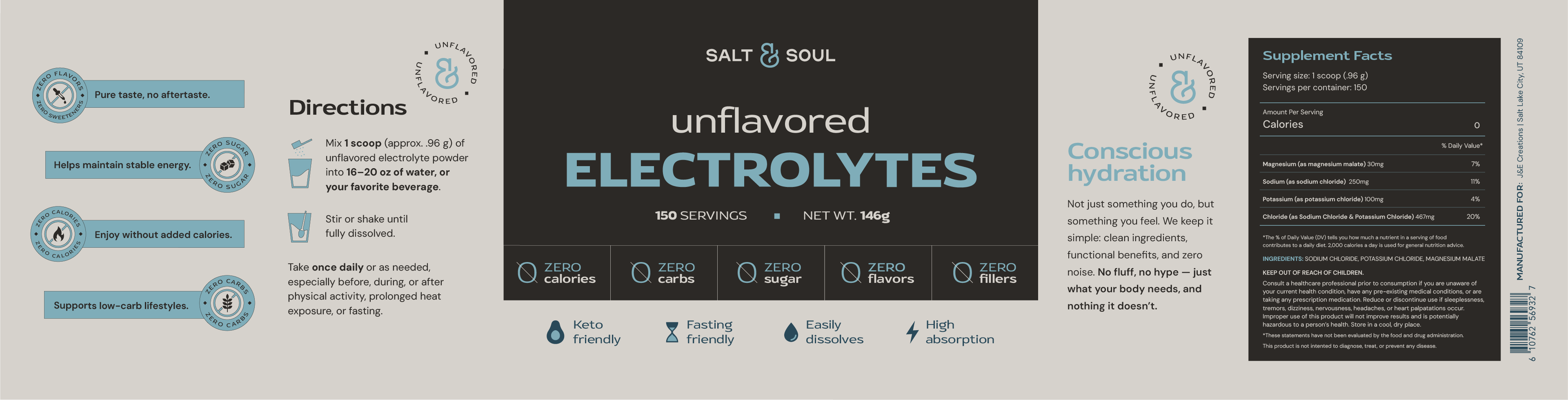
Most electrolyte packaging works against the buyer. Fruit explosions, a dozen flavors, sweeteners in the fine print, layouts so busy the serving size vanishes. For a product that sells purity, that's not the ideal way to show up.
Salt & Soul sells to people who fast, train, follow keto, or just read labels. The identity was built on contrast. Salt is the wordmark, a geometric sans, wide and undecorated. Soul is the ampersand, hand-drawn, in a light blue that breaks the bold lettering open. Photography follows the ampersand: real people, direct sun, open sky.

Process
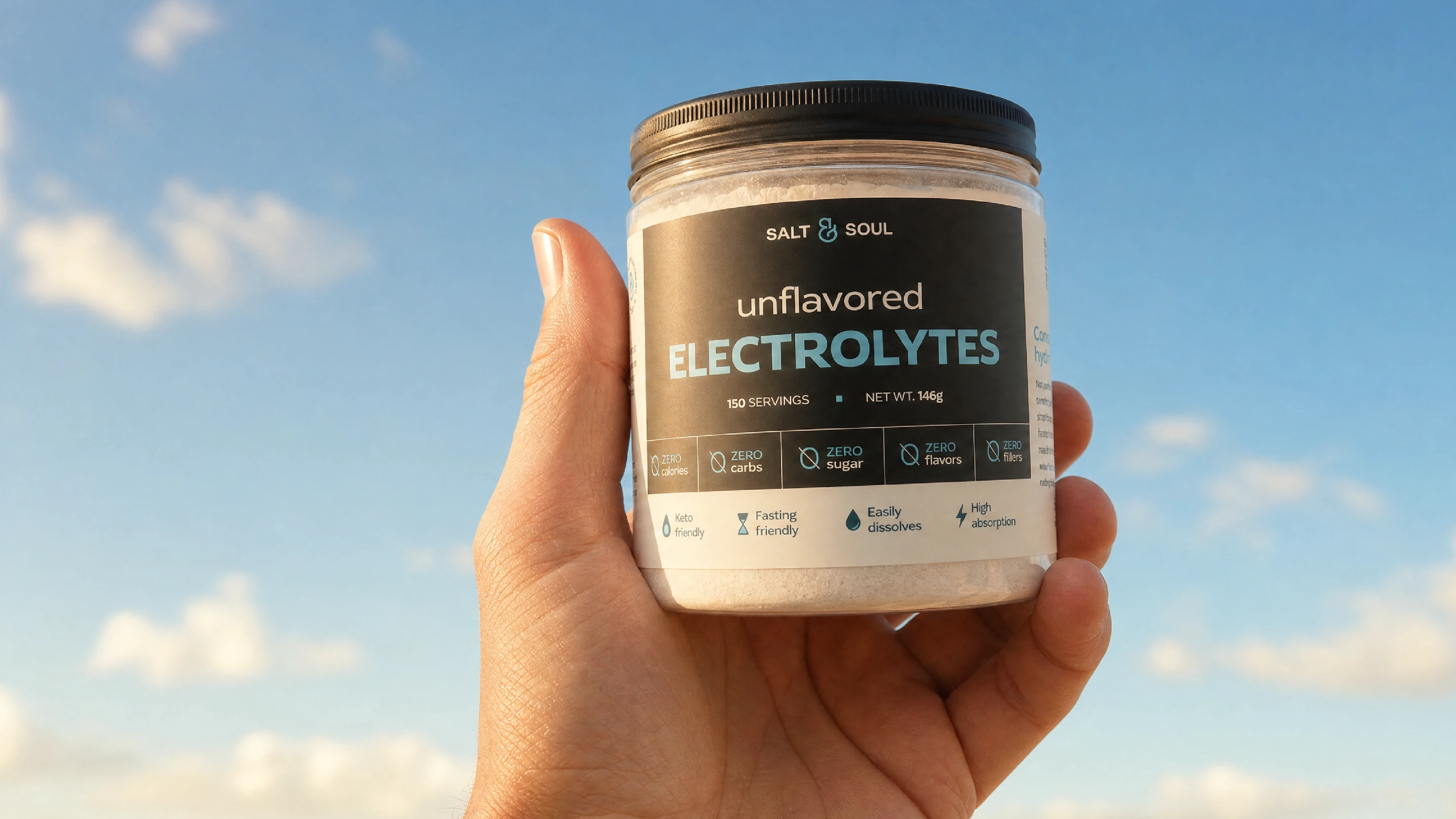
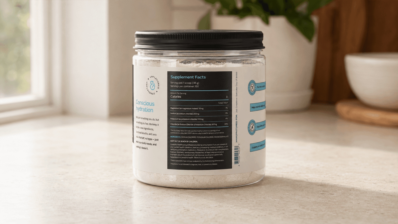
Blue is what everyone in the category reaches for. So our choice stayed small - only for accents, plus the unflavored variant - familiar enough to read as hydration without taking over the pack. The label got the same logic: name biggest, then the five zero claims, everything procedural pushed to the side panels.
Outcomes
The label had no shelf to lean on. It ships as a sticker on the jar and as a set of Amazon images, so it has to survive as a thumbnail and sell with no salesperson standing next to it. Every claim a buyer would scroll reviews to check sits on the pack instead. The promise gets kept before the lid comes off.