Brand Redesign
Overview
For 30+ years, Digi Office has helped retail and food service businesses stay in control - selling calm as much as software. The rebrand ditches the dated 90s cloud logo for a friendlier symbol, a bolder purple-and-turquoise palette, and one idea: technology that brings peace of mind.

ABOUT THE PROJECT
The company
Digi Office started back in 1995, when Beto and Roberto bet on the then-brand-new world of personal computers. Their first real win was selling software to restaurants in Minas Gerais - a small step on paper, a big one in practice. That was the market saying yes to automation. Thirty-one years later, they help retail and food service businesses across Brazil turn messy data into decisions they can actually trust.
The real product
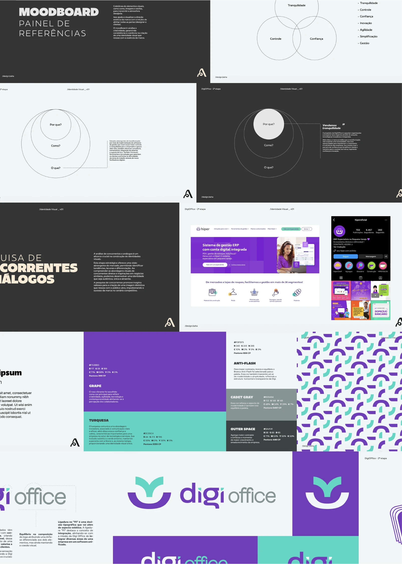
Ask what Digi Office sells and "software" is only half the answer. The other half is tranquility. Business owners spend their days putting out fires - stock, sales, cash flow, taxes - and Digi Office hands them the control panel, plus the rare feeling of being on top of it all. That single idea, "we sell tranquility," became the anchor for the entire rebrand.
The problem with the old look
The previous logo - a green-and-purple cloud sitting over a chunky uppercase wordmark - belonged to a different decade. It read "IT vendor," not "trusted partner." The company had grown up, gotten more strategic, and built a strong culture along the way. The brand was running about ten years behind all of that.
The new mark
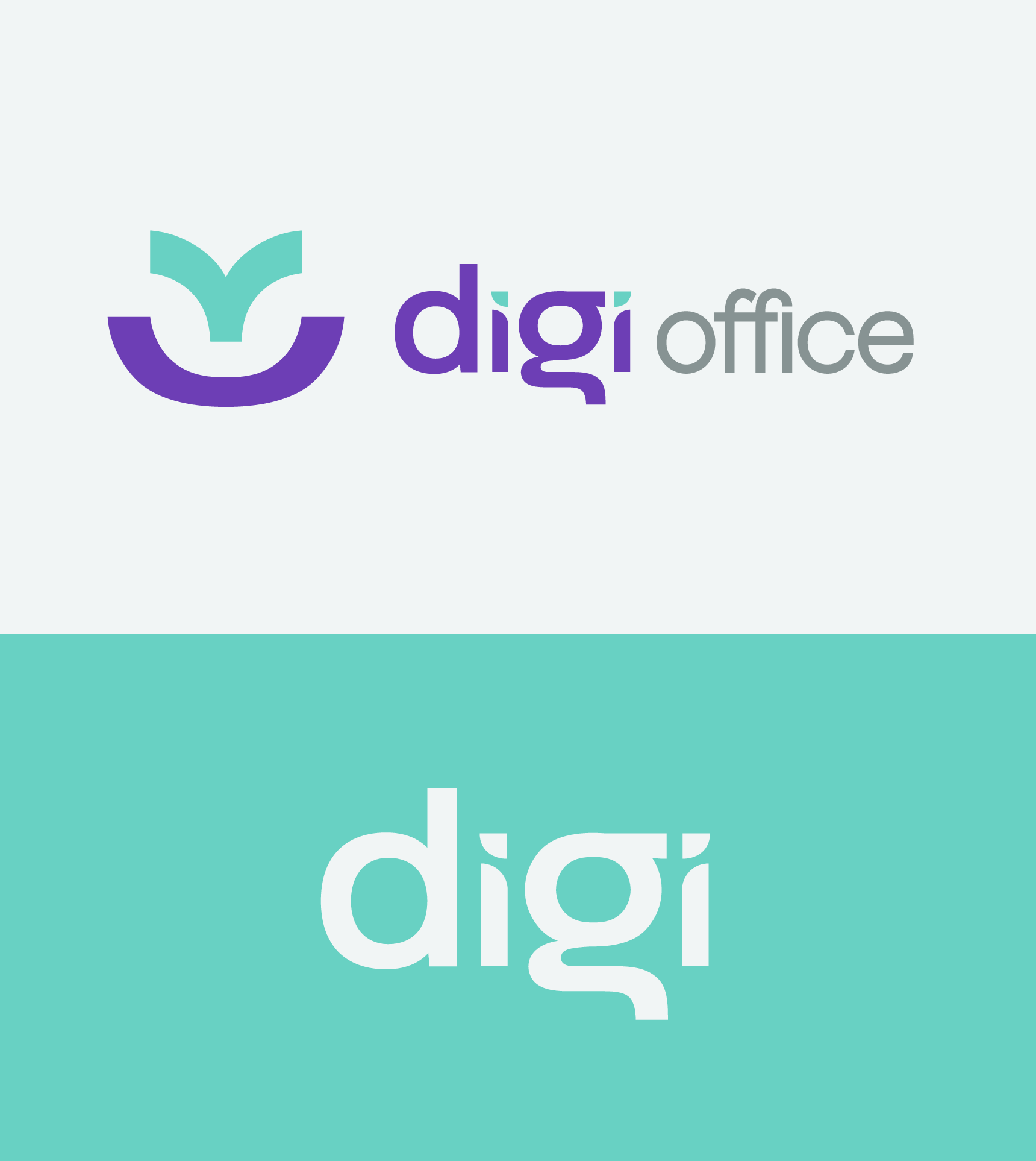
The new symbol works on two levels. Look one way and it's a sprout coming out of a bowl - growth, momentum, a business getting bigger. Look again and the whole shape turns into a calm little smile: friendly, human, in control. The wordmark trades the shouting caps for soft lowercase letters, and a subtle "ffi" ligature ties them together - a quiet nod to what Digi Office does for a living: pulling the scattered parts of a business into one system.
The palette
The dated lime green is gone. In its place, a vibrant grape purple (creativity, tech, a little edge) paired with a fresh turquoise (clarity, calm, confidence). Anti-flash white and cadet gray keep everything light and modern, so the brand feels organized rather than loud - which, for a company selling peace of mind, is kind of the whole point.
The system
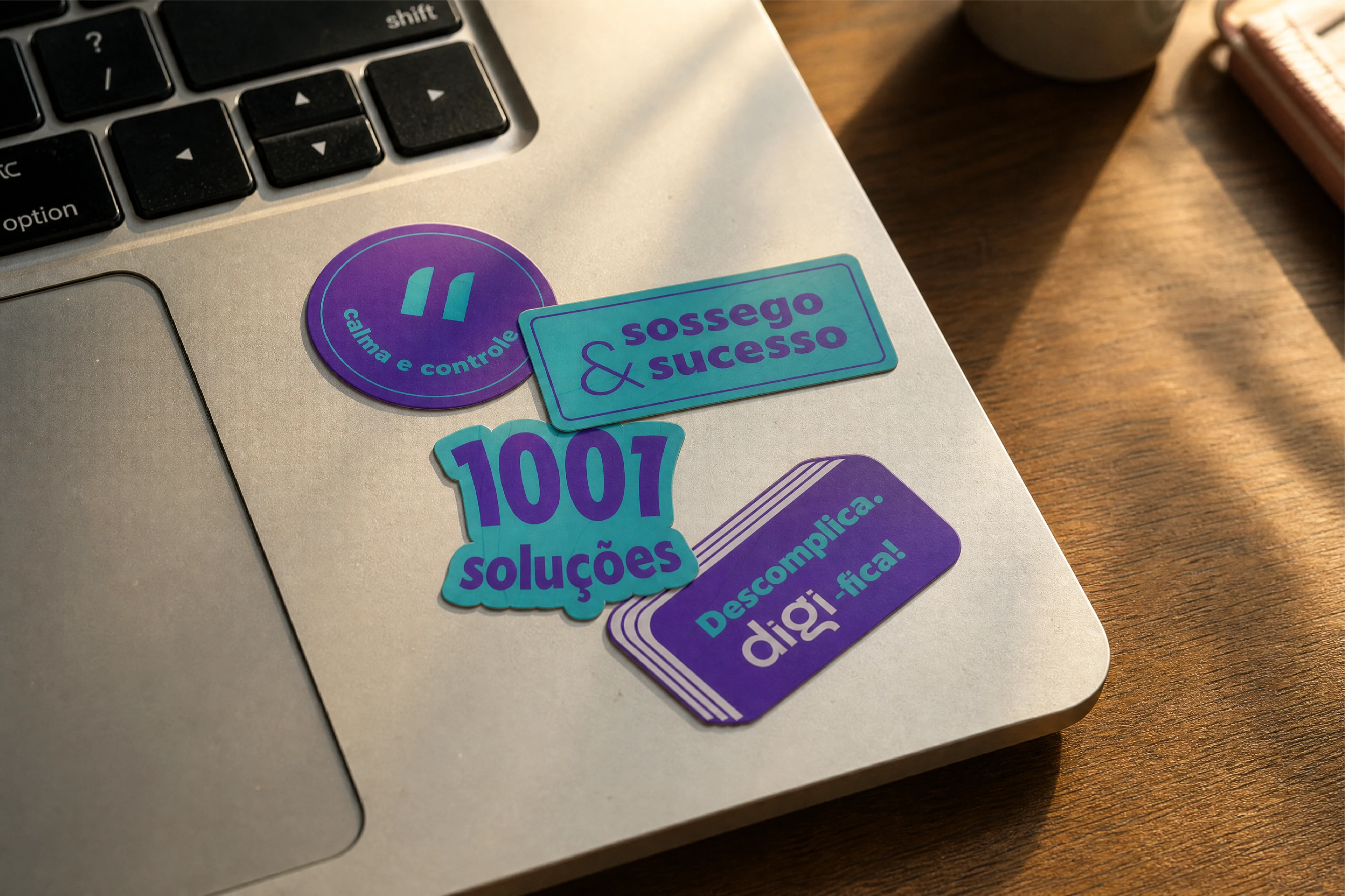
From there it spreads everywhere: playful geometric patterns built from the logo's own curves, social templates, stickers, uniforms, ID badges, table displays, the full Instagram grid. Same personality on every touchpoint - human, close, easy to trust. Exactly how Digi Office wants to feel to the people it works with.







Explore More