Brand design and label design
Overview
Salt & Soul makes unflavored electrolytes for people who want hydration and nothing else. The identity follows the same logic: a clean wordmark, one expressive ampersand, and a label that answers every question at a glance. Zero sugar, zero flavors, zero noise.

ABOUT THE PROJECT
The brand
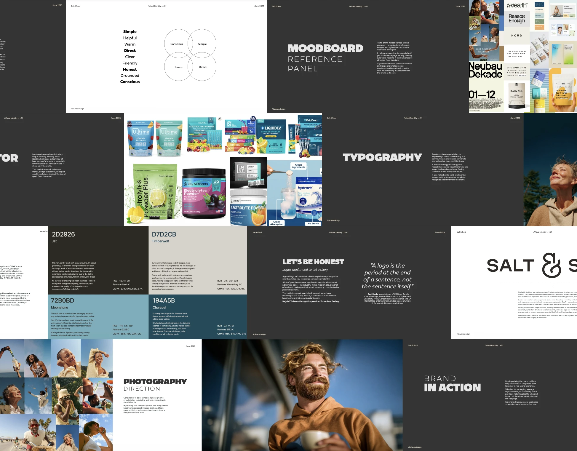
Salt & Soul sells electrolytes, but the people behind it describe it as a wellness community first. Their audience is health-conscious - people who fast, train, follow keto, or simply pay attention to what goes into their water. The brand says what it does before anything else: hydration. Nine words guided every decision in this project: simple, helpful, warm, direct, clear, friendly, honest, grounded, and conscious.
The problem with the shelf
Most electrolyte packaging works against the buyer. Fruit explosions, a dozen flavors, sweeteners hiding in the fine print, and layouts so busy you can't find the serving size. For a product whose whole appeal is purity, that's a strange way to show up. Salt & Soul needed the opposite: a pack you can read from across the kitchen.
The logo
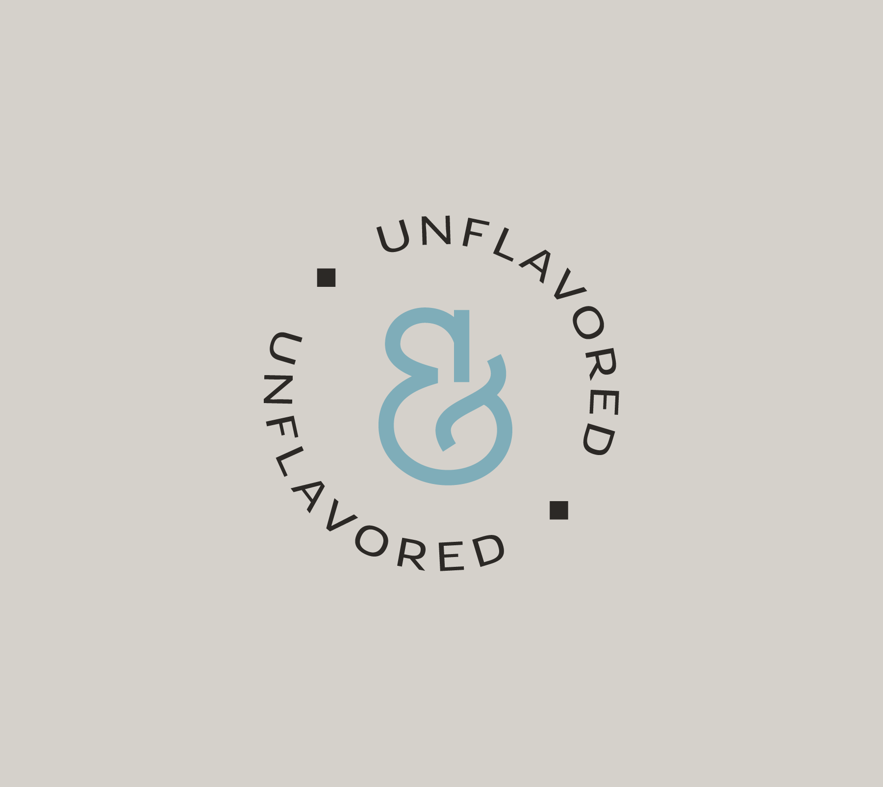
The wordmark carries the "Salt" side of the name - essential, grounded, reliable. Solid letters, generous spacing, nothing decorative. The real hero is the ampersand. Drawn by hand with soft, organic curves, it carries the "Soul" - expressive, emotional, fluid. A droplet-shaped terminal gives it a human touch and a sense of movement, almost like a small gesture. It's strong enough to stand alone, which is exactly how it's used: as a submark, in the unflavored badge, and as the connective thread across the whole identity.
The palette
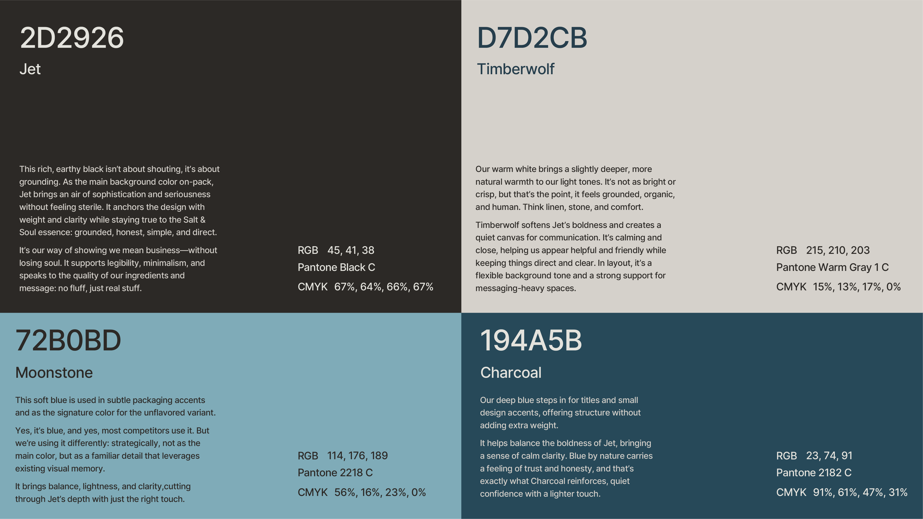
Four colors, each doing a specific job. Jet, a rich earthy black, anchors the pack with weight and seriousness without feeling sterile. Timberwolf, a warm off-white, keeps things organic and calm - think linen and stone. Moonstone, the soft blue, marks the unflavored variant and borrows the visual memory people already have of hydration brands, used as a detail instead of a crutch. Charcoal, a deep teal blue, handles titles and small accents, bringing the trust that blue naturally carries.
The label
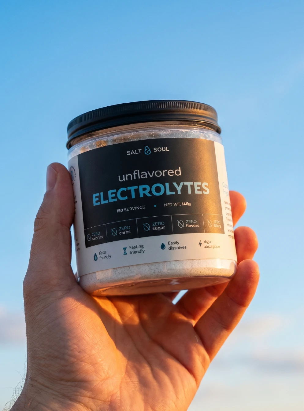
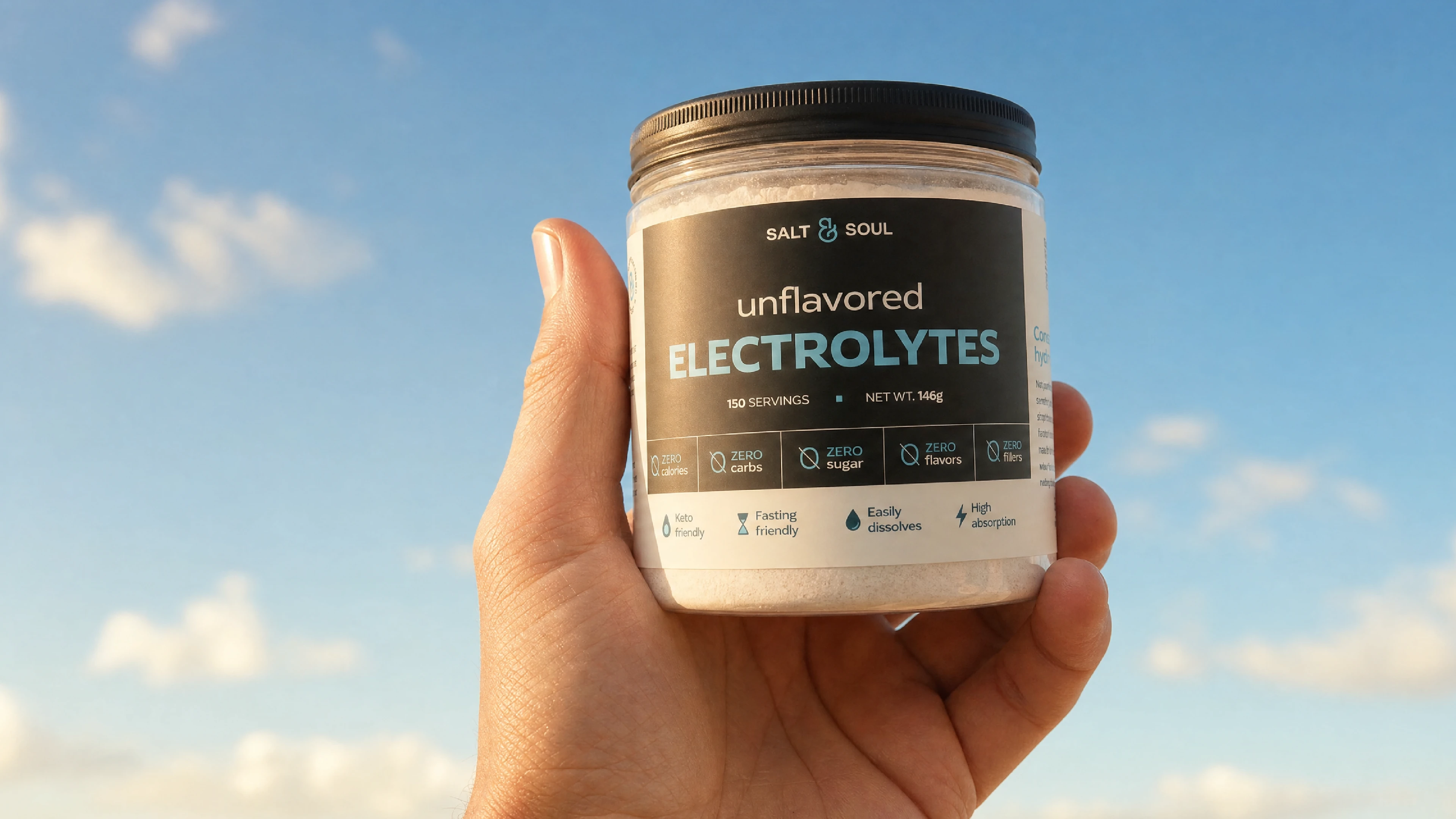
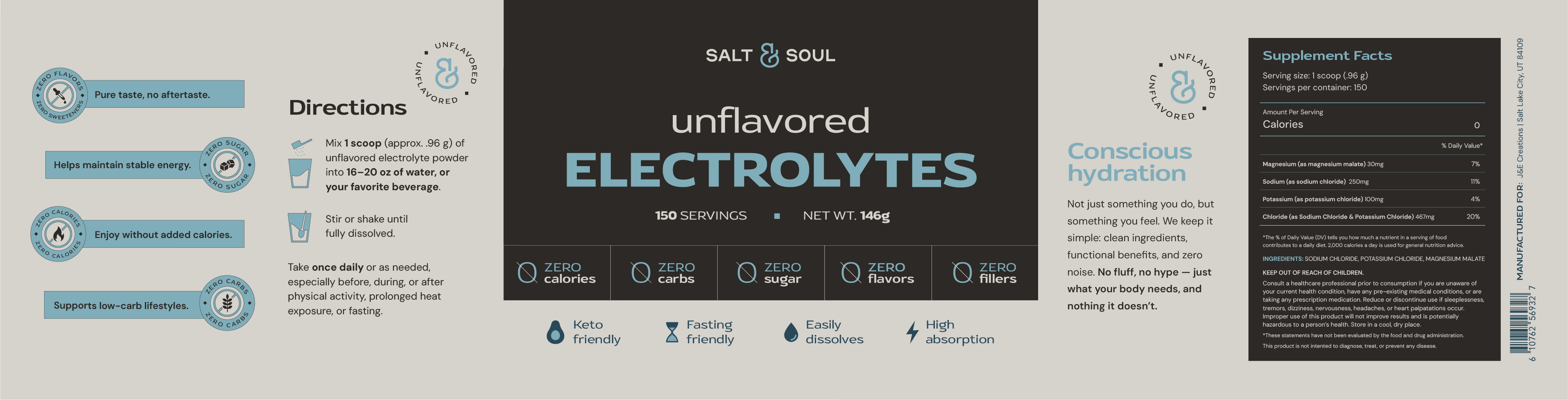
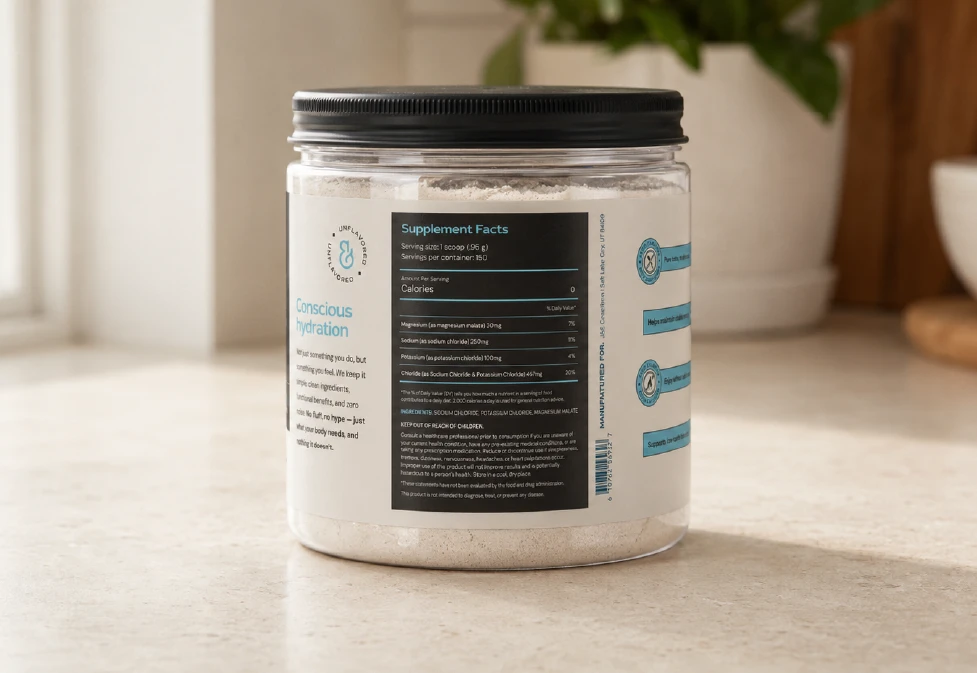
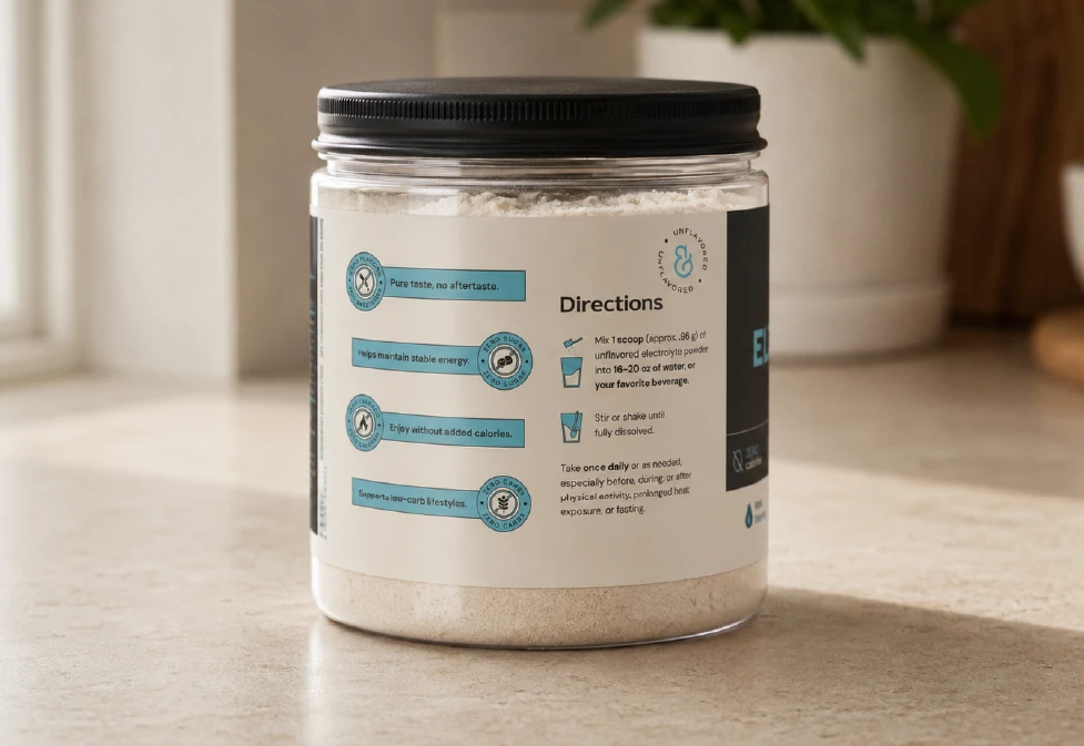
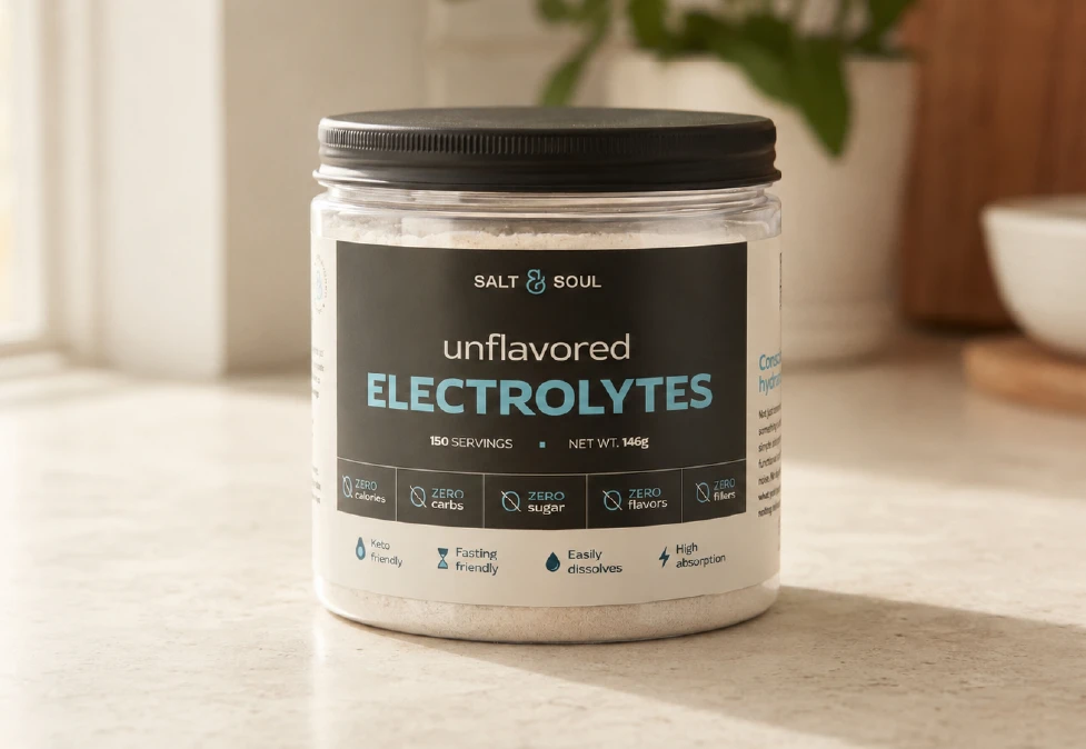
The client needed a sticker for the jar and images for their Amazon page, so the label had to sell on its own. The front leads with the product name in the largest type on the pack, followed by the five claims that matter most to this buyer: zero calories, zero carbs, zero sugar, zero flavors, zero fillers. The side panels answer the questions people usually scroll reviews to find - how to mix it, when to take it, what's in each scoop - plus a short manifesto on conscious hydration. Everything a shopper needs, readable at a glance.
The result
A brand that keeps its promise before you even open the jar. Clear name, honest claims, one memorable ampersand - and a pack that stands out on Amazon precisely because it refuses to shout.



Explore More