Visual Identity
Overview
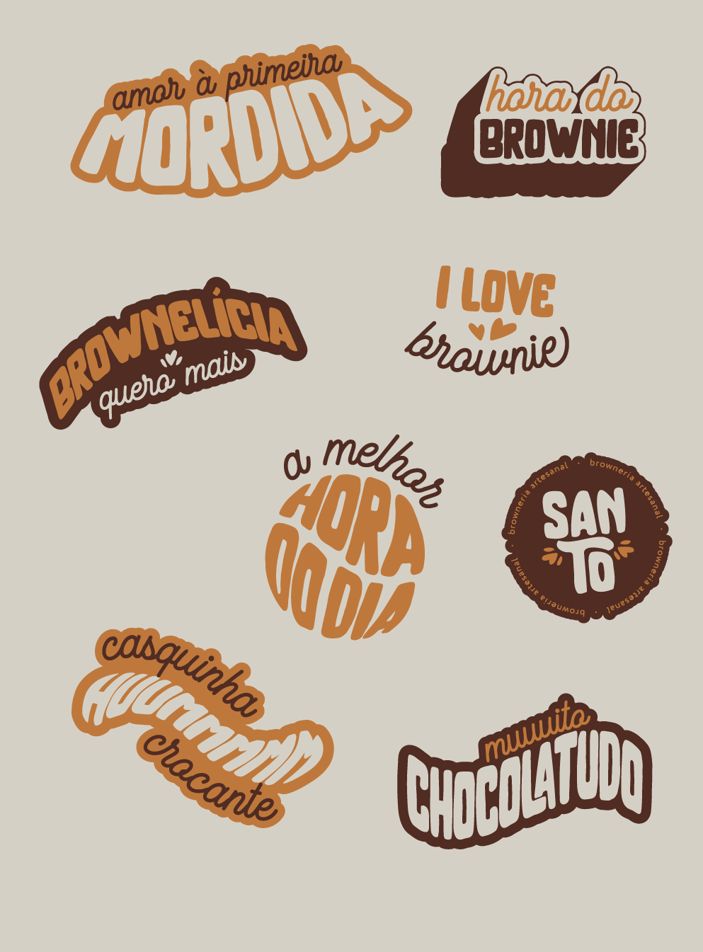
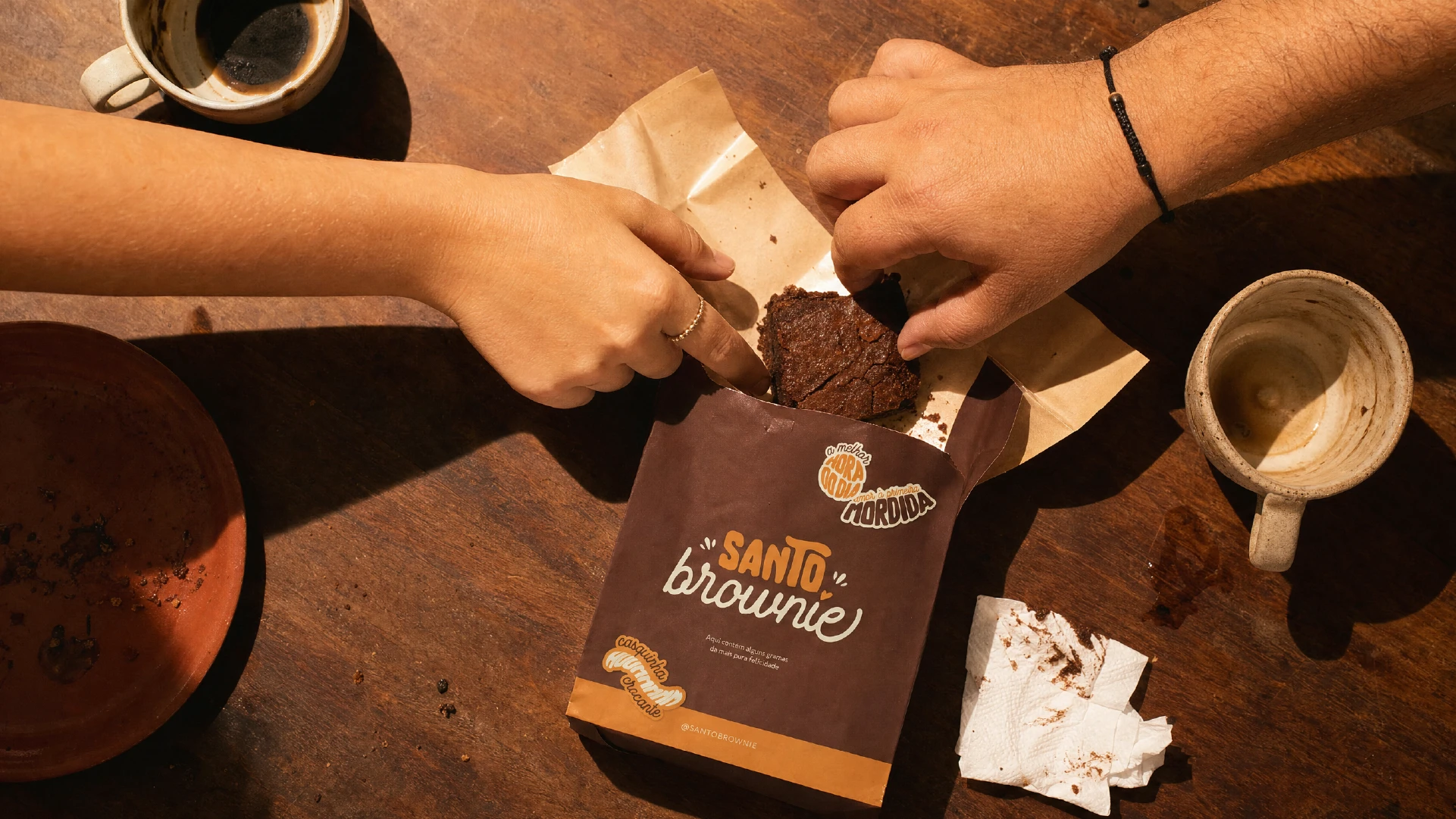
This is a branding study I created to win a client in the confectionery segment - and it worked. Built with Plau's Brand Cooker method, the project shows what a brownie brand could look like: a hand-lettered logotype and a warm brown-orange-cream palette built around the Caregiver archetype. Days after presenting it, I closed a real project in the same niche.
ABOUT THE PROJECT
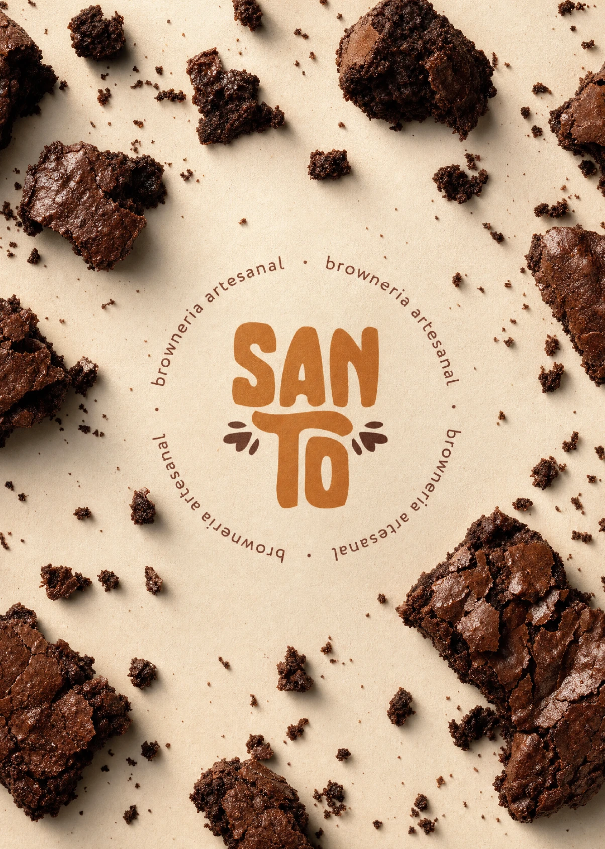
I started Santo Brownie as a personal exercise, a chance to get hands-on with Plau's BrandCooker and see how its method held up on a real brief. Brownies and artisan confectionery gave me the perfect test case: a product built entirely on comfort, indulgence, and personal touch.
The timing wasn't random. I'd just connected with a prospective client in the same segment, and while I loved her product, her brand wasn't saying the same thing yet. I had a hunch her customers felt that gap too (drawn to the product, disconnected from the visual identity around it).
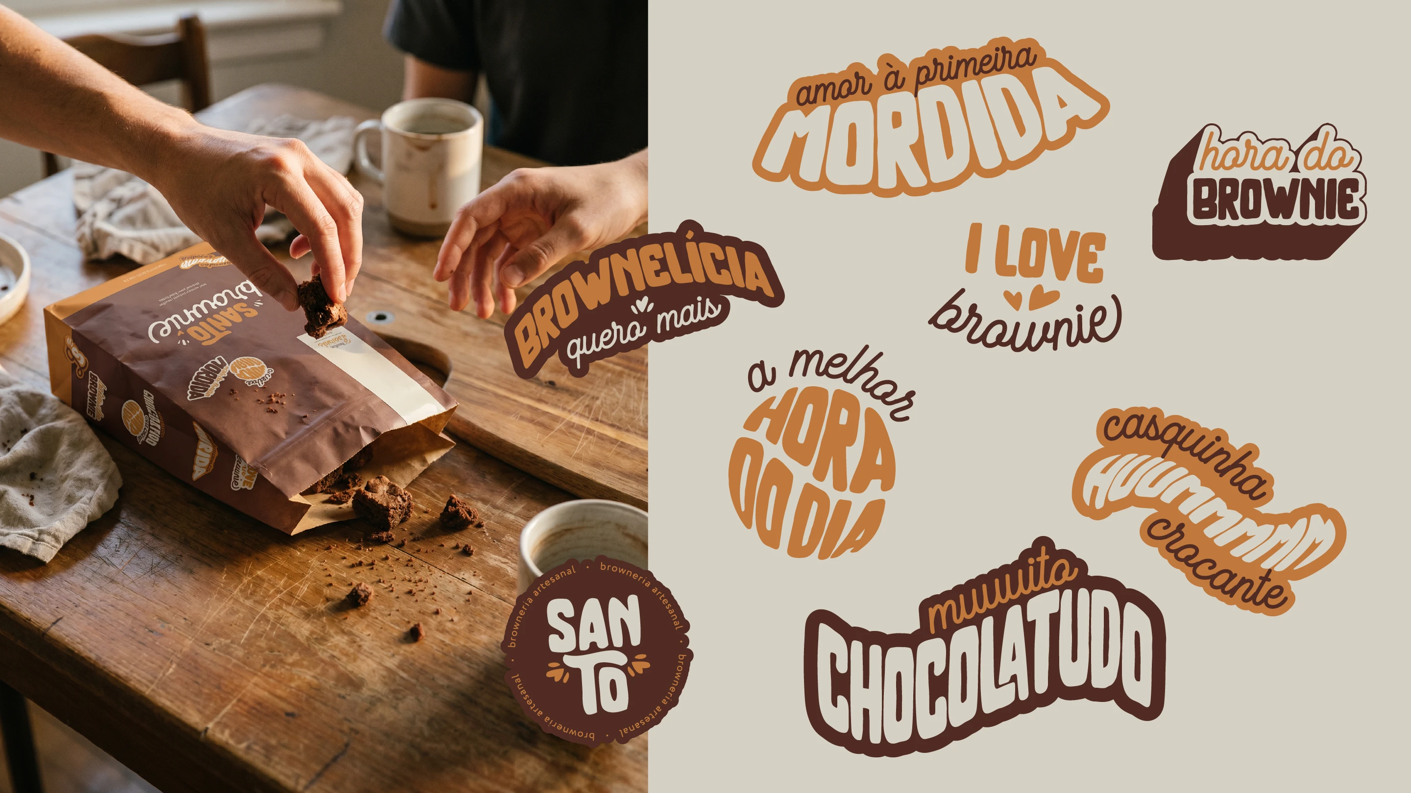
So the logotype leans into script and rough all-caps typography and a warm brown-orange-cream palette, built around the Caregiver archetype: expressive, creative, a little nostalgic. I used Santo Brownie to show what a rebrand could actually look like, not just describe it.
It worked. Shortly after presenting the project, I closed a real branding engagement in the same segment, proof that sometimes the best pitch is just doing the work.




Explore More