Branding & Website
Overview
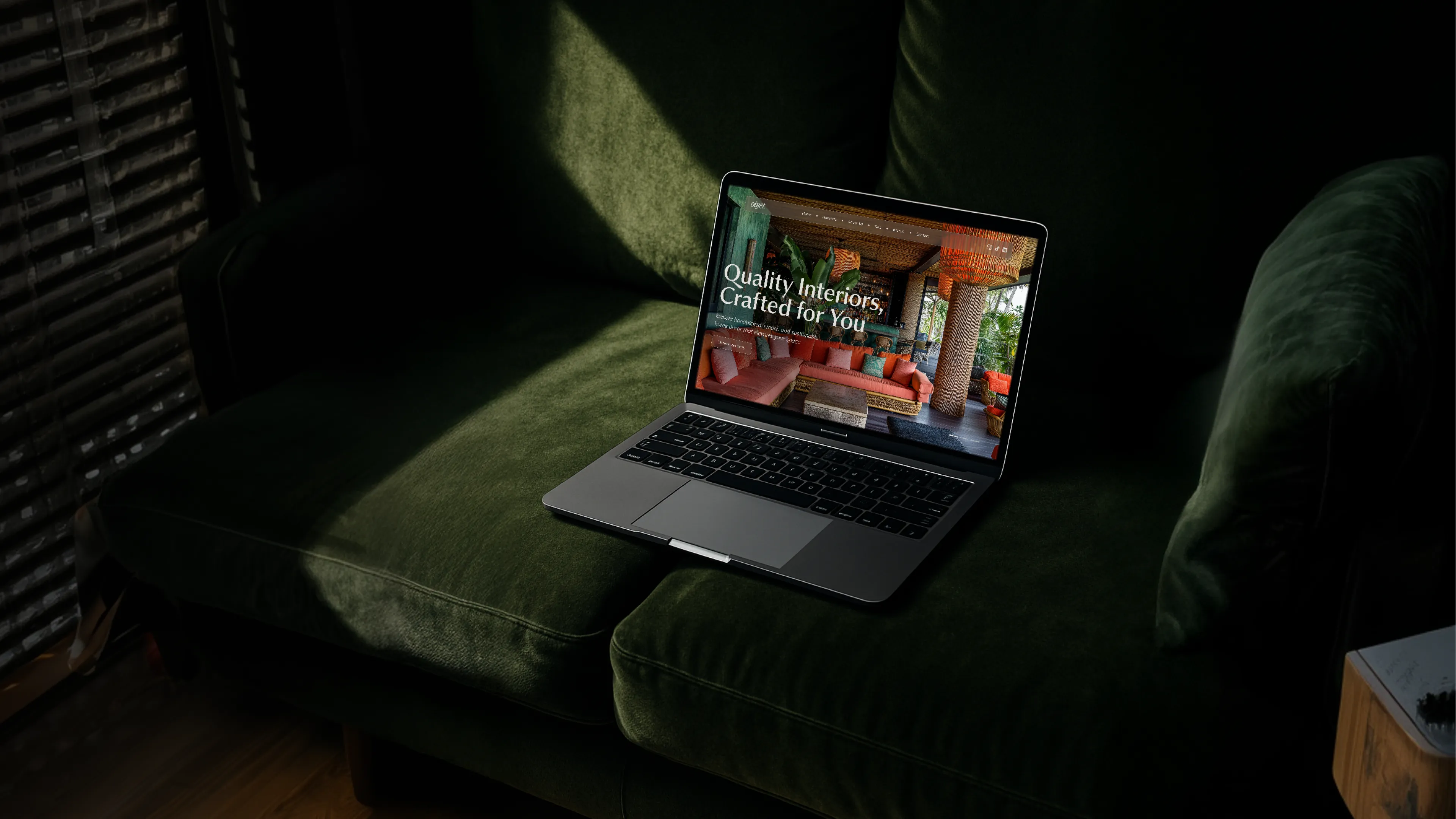
Brand identity for Objet, an interior design label built on contrast. Two typefaces in dialogue, vintage illustrations alongside contemporary photography, and a three-color palette holding it all with quiet confidence.
ABOUT THE PROJECT
Most interior brands lean one way, either the curated catalog or the warm lifestyle feel. Objet carries both.
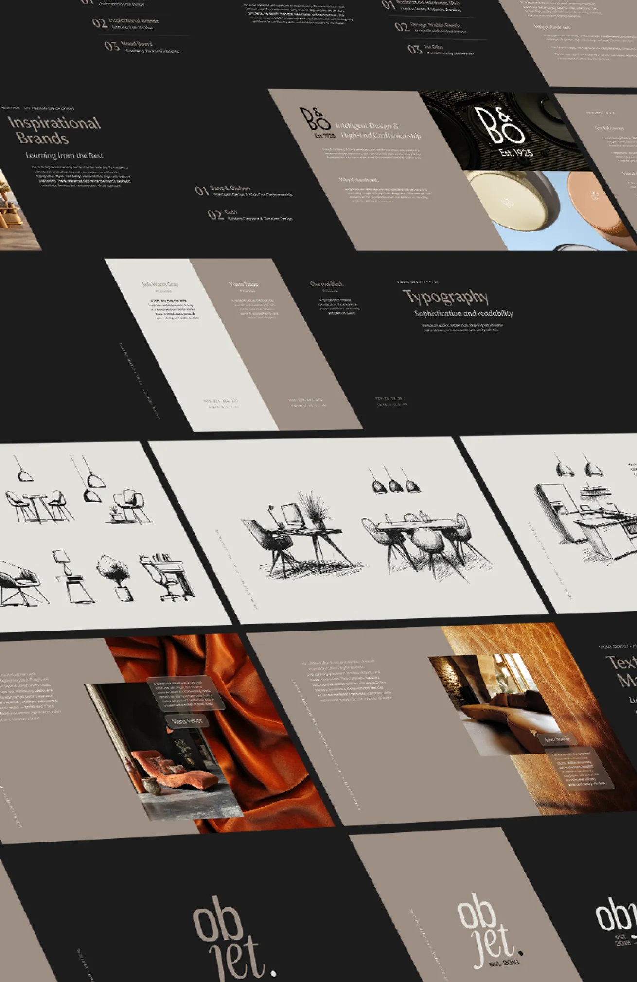
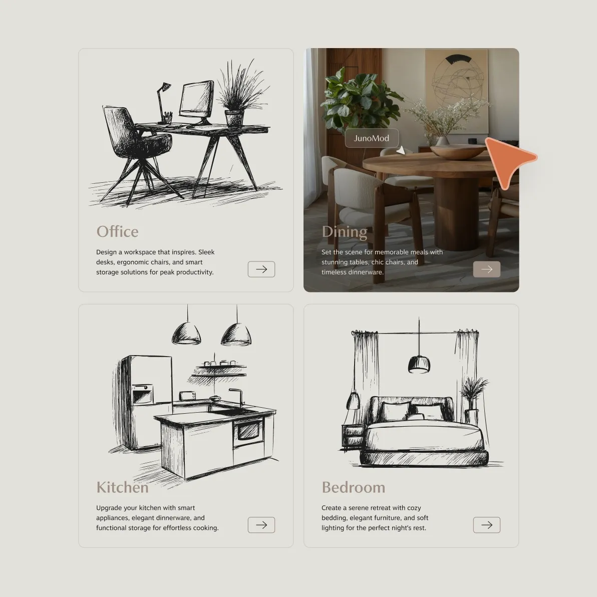
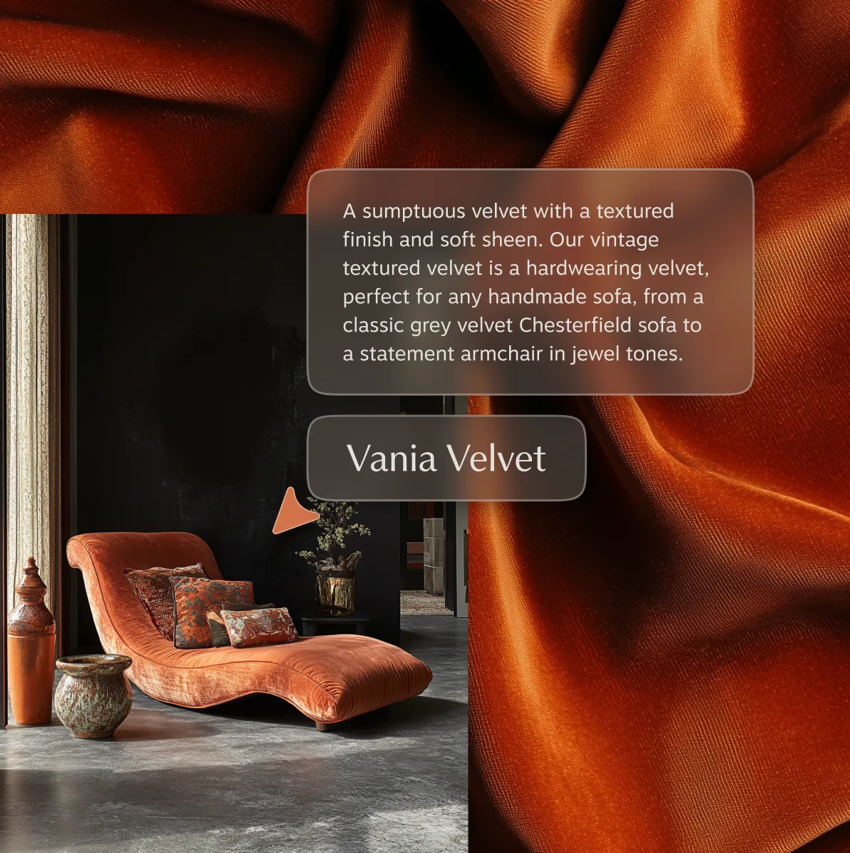
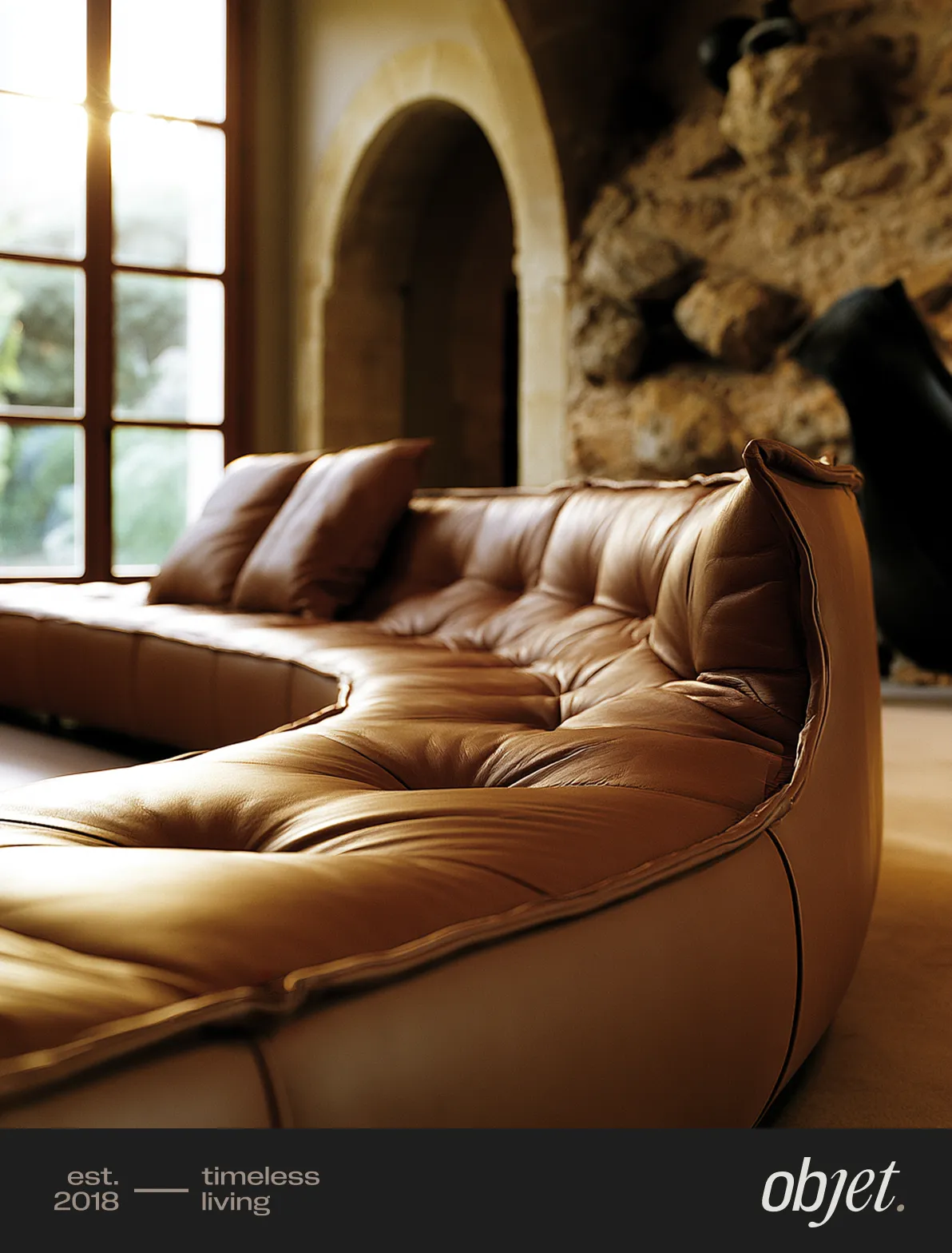
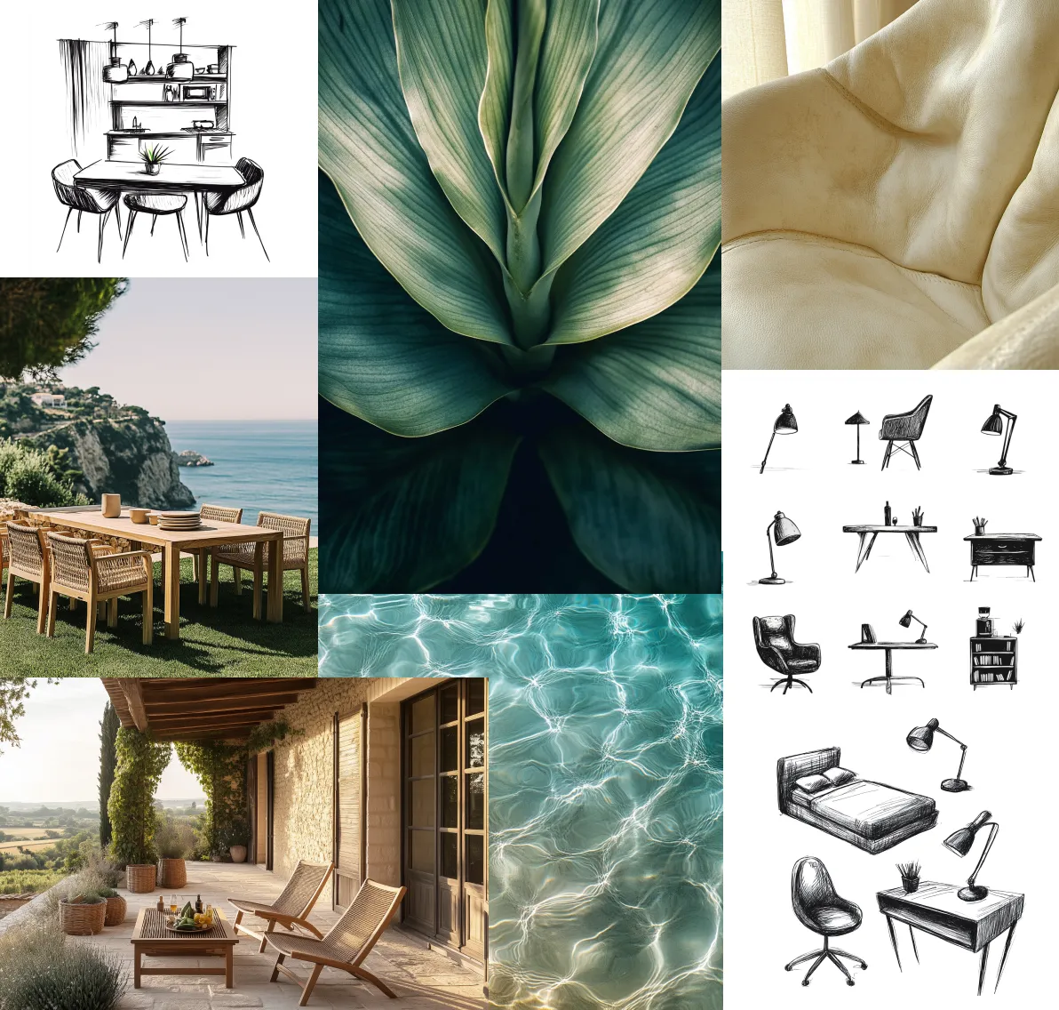
The identity's sharpest call was the illustration system: furniture hand-drawn in rough etching lines, set alongside contemporary photography of high-end furniture. The contrast between the two becomes the brand. Old craft sensibility, modern material richness - in the same frame.
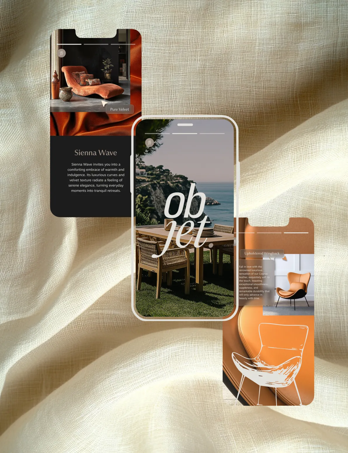
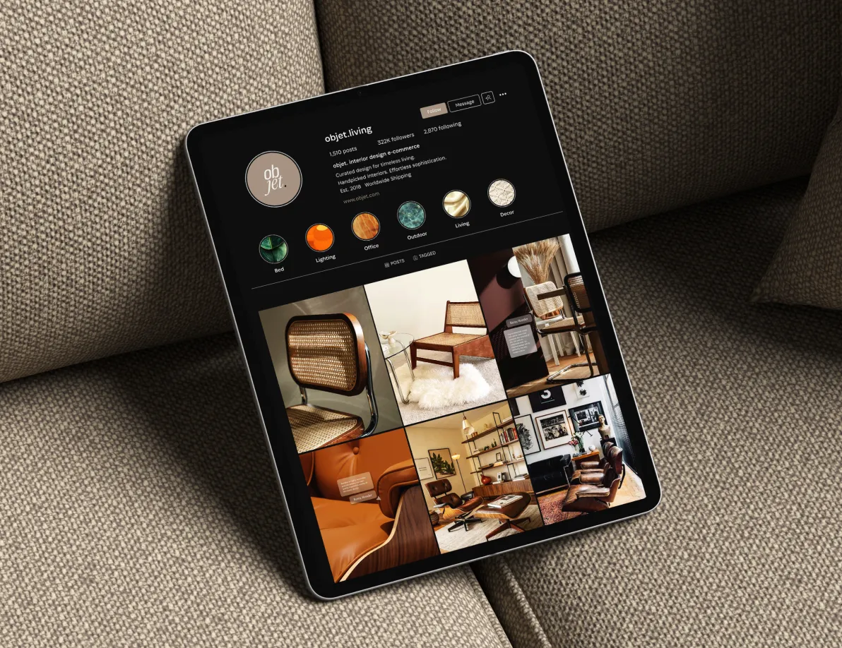
Three colors do the rest: near-black, warm taupe, off-white. The logo creates the contrast between the bold, modern and structured “ob” and the fluid, elegant “jet”. It represents the balance of precision and artistry, modernity and nostalgia. The scope ran from brand guidelines and typography to illustration direction, UI prototypes, and an Instagram identity.




Explore More