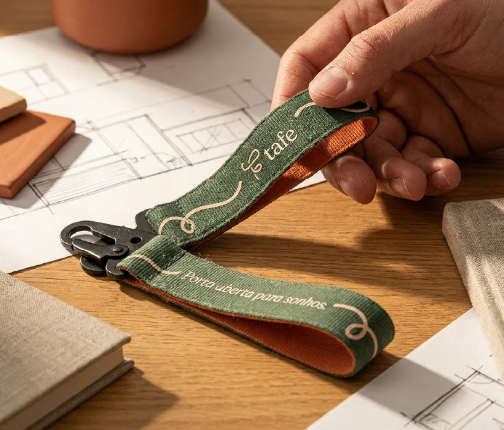
Hand holding a green and orange fabric wrist keychain with the Tafe logo and the phrase "Porta aberta para sonhos" printed on both sides, resting against a wooden desk with architectural sketches in the background.

TAFE

TAFE

Brand Identity

Overview

Tafe is the brand of Taciara and Félix - two real estate agents whose practice runs on empathy and transparency. No existing identity, one clear challenge: communicate trust without losing the warmth clients already relied on.

A terracotta ceramic mug with the Tafe logo and the phrase "Onde o amor reside, o lar floresce" printed on it, with steam rising from the coffee inside, photographed on a warm wooden surface.

ABOUT THE PROJECT

Buying or selling a home sits in a peculiar category of life events - big enough to feel like a milestone, complicated enough to feel like a trap.

Taciara and Félix were already doing the hard part right. Their clients trusted them, the experience felt human. What their brand communicated was a different story - they had nothing to show for it visually. In a market where trust is the whole product, that gap was working against them.

The brief came down to one tension: credibility and warmth rarely live in the same room. Every decision traced back to the way they work with clients - direct, easy, relaxed. The identity was built outward from that. Deliverables covered the full client-facing map: visual identity, photo direction, Instagram templates, and promotional materials.

The result was a brand that finally looked like the people behind it.
Tafe's primary logo on a cream background — a fluid hand-drawn monogram in burnt orange paired with the "tafe" wordmark in dark green serif type, and the descriptor "Consultoria Imobiliária" in spaced capitals below.
Tafe's color palette featuring four swatches from left to right: champagne cream, burnt sienna orange, soft salmon pink, and deep forest green.
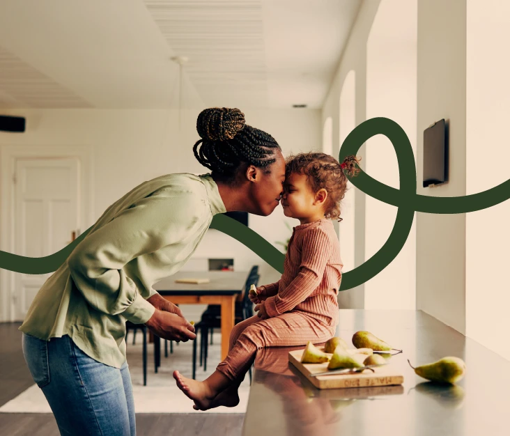
A Black mother leaning in for a nose kiss with her toddler sitting on a kitchen counter, surrounded by pears on a cutting board. A dark green curving line graphic from the Tafe brand overlays the image.
Hand holding a green and orange fabric wrist keychain with the Tafe logo and the phrase "Porta aberta para sonhos" printed on both sides, resting against a wooden desk with architectural sketches in the background.
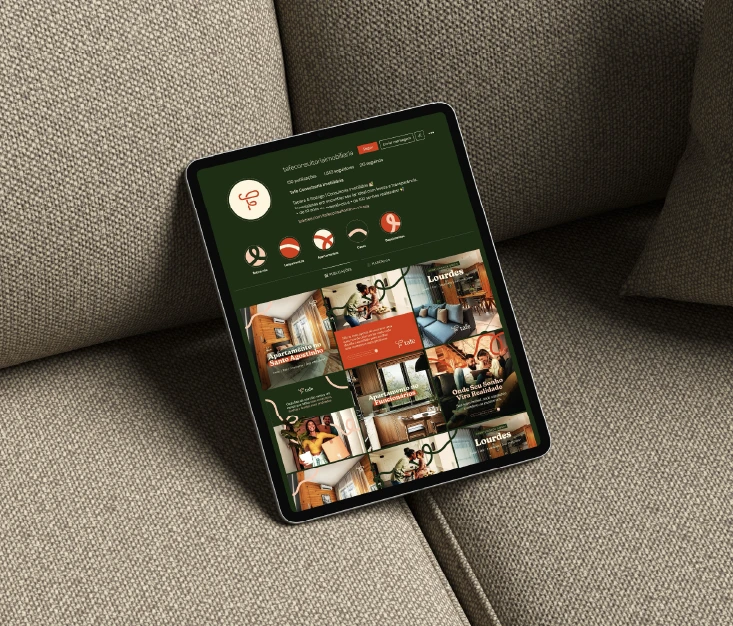
An iPad displaying Tafe's Instagram profile grid, showing a cohesive feed that alternates between lifestyle photography and apartment listing posts in the brand's green, orange, and cream palette.
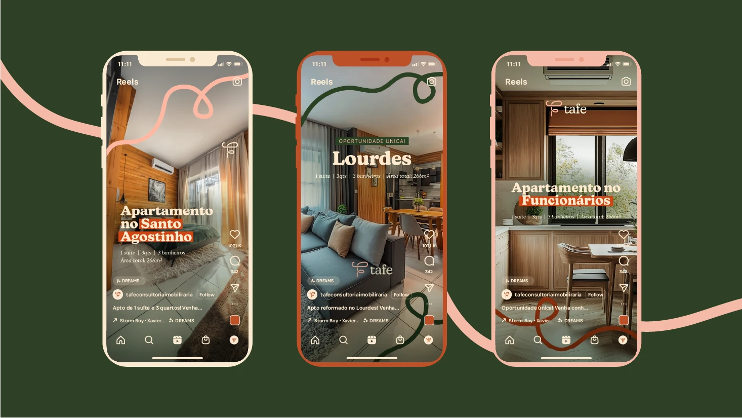
Three smartphone mockups showing Tafe's Instagram Reels templates for property listings — featuring apartments in Santo Agostinho, Lourdes, and Funcionários neighborhoods, each with property specs and the Tafe brand overlay.
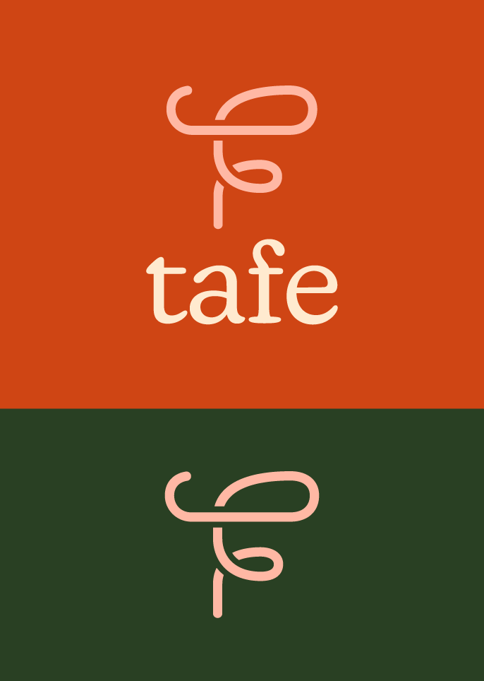
Two logo variations on solid backgrounds — the Tafe monogram with wordmark on burnt orange, and the standalone monogram icon on deep forest green.
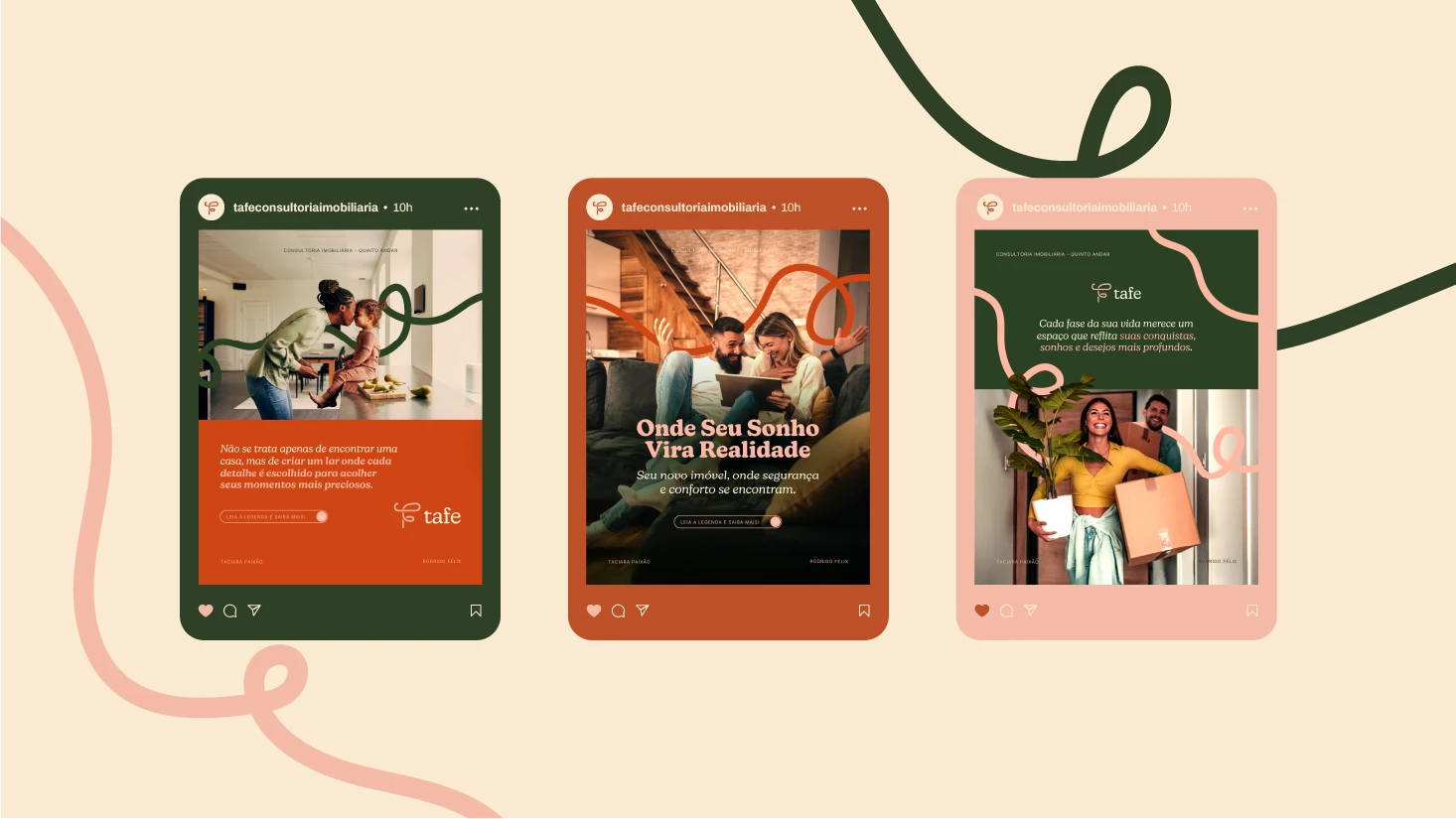
Three Instagram post mockups showing Tafe's social media templates — a lifestyle post with a mother and child, a property highlight post with bold heading "Onde Seu Sonho Vira Realidade", and a duo portrait post on a pink background.
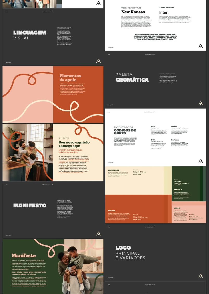
A collage of Tafe's brand guidelines pages, including sections on visual language, support graphic elements, color codes, manifesto, typography pairing of New Kansas and Inter, and logo variations.
Tafe's primary logo on a cream background — a fluid hand-drawn monogram in burnt orange paired with the "tafe" wordmark in dark green serif type, and the descriptor "Consultoria Imobiliária" in spaced capitals below.
Three smartphone mockups showing Tafe's Instagram Reels templates for property listings — featuring apartments in Santo Agostinho, Lourdes, and Funcionários neighborhoods, each with property specs and the Tafe brand overlay.
Tafe's color palette featuring four swatches from left to right: champagne cream, burnt sienna orange, soft salmon pink, and deep forest green.
Two logo variations on solid backgrounds — the Tafe monogram with wordmark on burnt orange, and the standalone monogram icon on deep forest green.
A Black mother leaning in for a nose kiss with her toddler sitting on a kitchen counter, surrounded by pears on a cutting board. A dark green curving line graphic from the Tafe brand overlays the image.
Three Instagram post mockups showing Tafe's social media templates — a lifestyle post with a mother and child, a property highlight post with bold heading "Onde Seu Sonho Vira Realidade", and a duo portrait post on a pink background.
Hand holding a green and orange fabric wrist keychain with the Tafe logo and the phrase "Porta aberta para sonhos" printed on both sides, resting against a wooden desk with architectural sketches in the background.
A collage of Tafe's brand guidelines pages, including sections on visual language, support graphic elements, color codes, manifesto, typography pairing of New Kansas and Inter, and logo variations.
An iPad displaying Tafe's Instagram profile grid, showing a cohesive feed that alternates between lifestyle photography and apartment listing posts in the brand's green, orange, and cream palette.

Explore More

Other projects

Open to new projects

Open to new projects